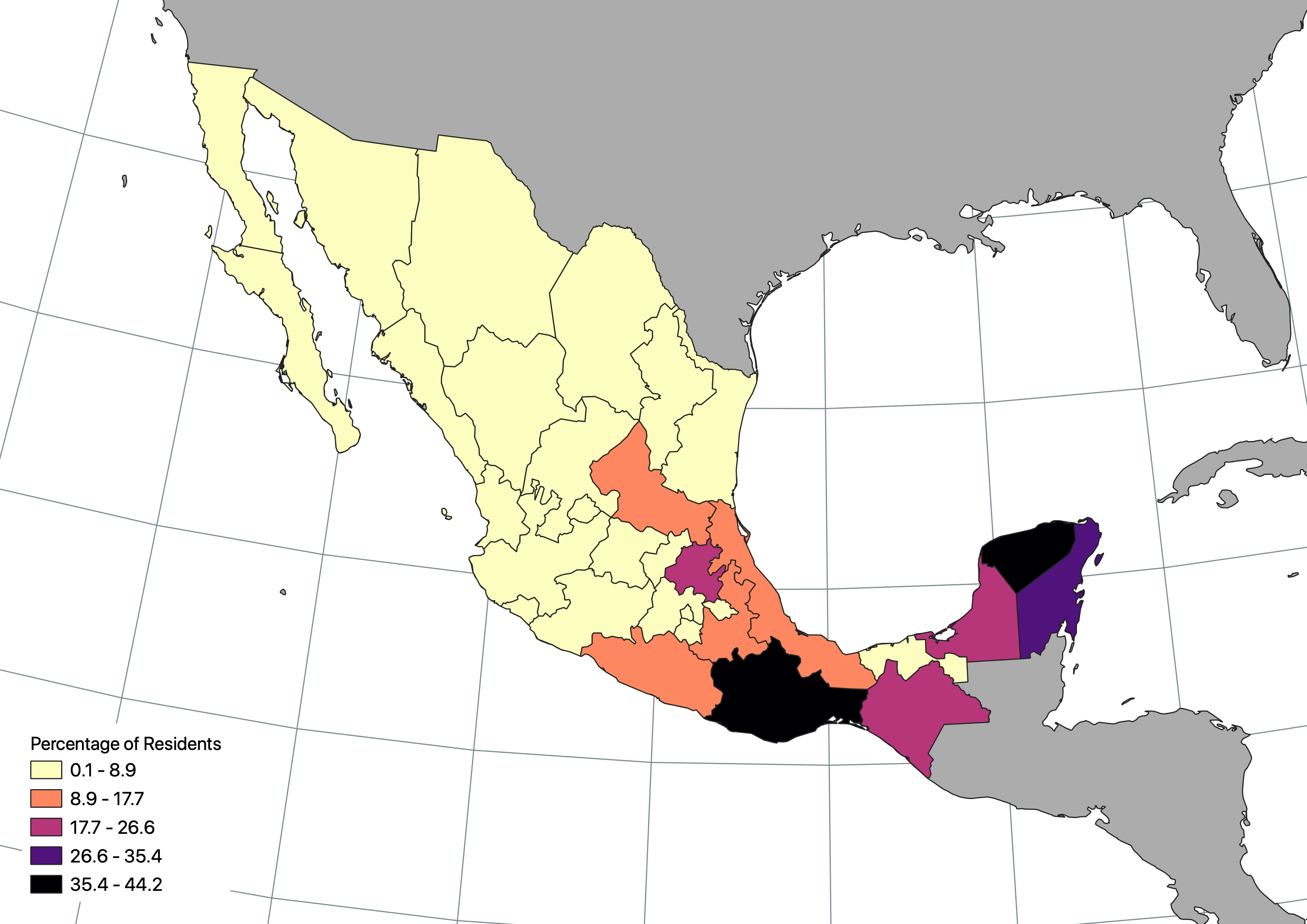
Mexico Indigenous Language Use
Note: The original layout did not include a legend - it was added for the profile.
This map depicts the percentage of residents who speak an indigenous language in Mexico.
Featured on this page is a wider collection of various assignments and projects completed for select GIS courses taken at Central Washington University.
Courses featured include: GEOG301 (Intro to GIS & Maps), GEOG303 (GIS & Data Management), GEOG404 (GIS Analysis), and GEOG417 (Workplace GIS).
NOTE: If you're a current student of Dr. Quinn, welcome to my site. Feel free to browse around, but please don't copy my work to complete your assignments. I have these maps shown on my website because I like to show off. The purpose of these assignments and projects is to reinforce what you were taught in lectures, and you will benefit far more if you do your own work. Thanks!

Note: The original layout did not include a legend - it was added for the profile.
This map depicts the percentage of residents who speak an indigenous language in Mexico.
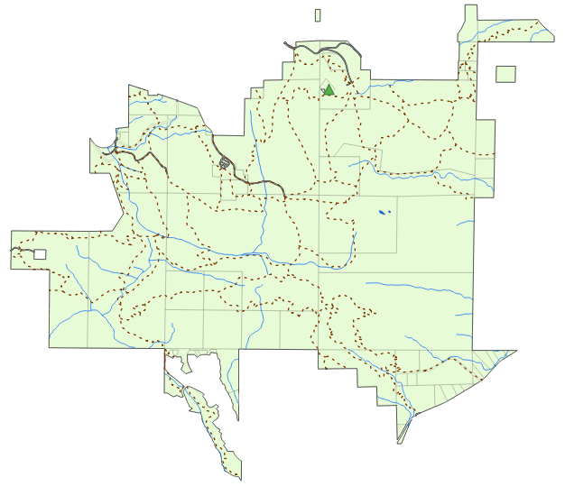
This is a map of the Cougar Mountain Regional Wildland Park in King County, WA, created as
part of a lesson (and subsequent graded discussion) introducing the concept of workng with
spatial data and creating maps with that data.
The map depicts the following layers in order: Mountain peak, trails, roads, bodies of
water, rivers/creeks, parcels, and the boundary.
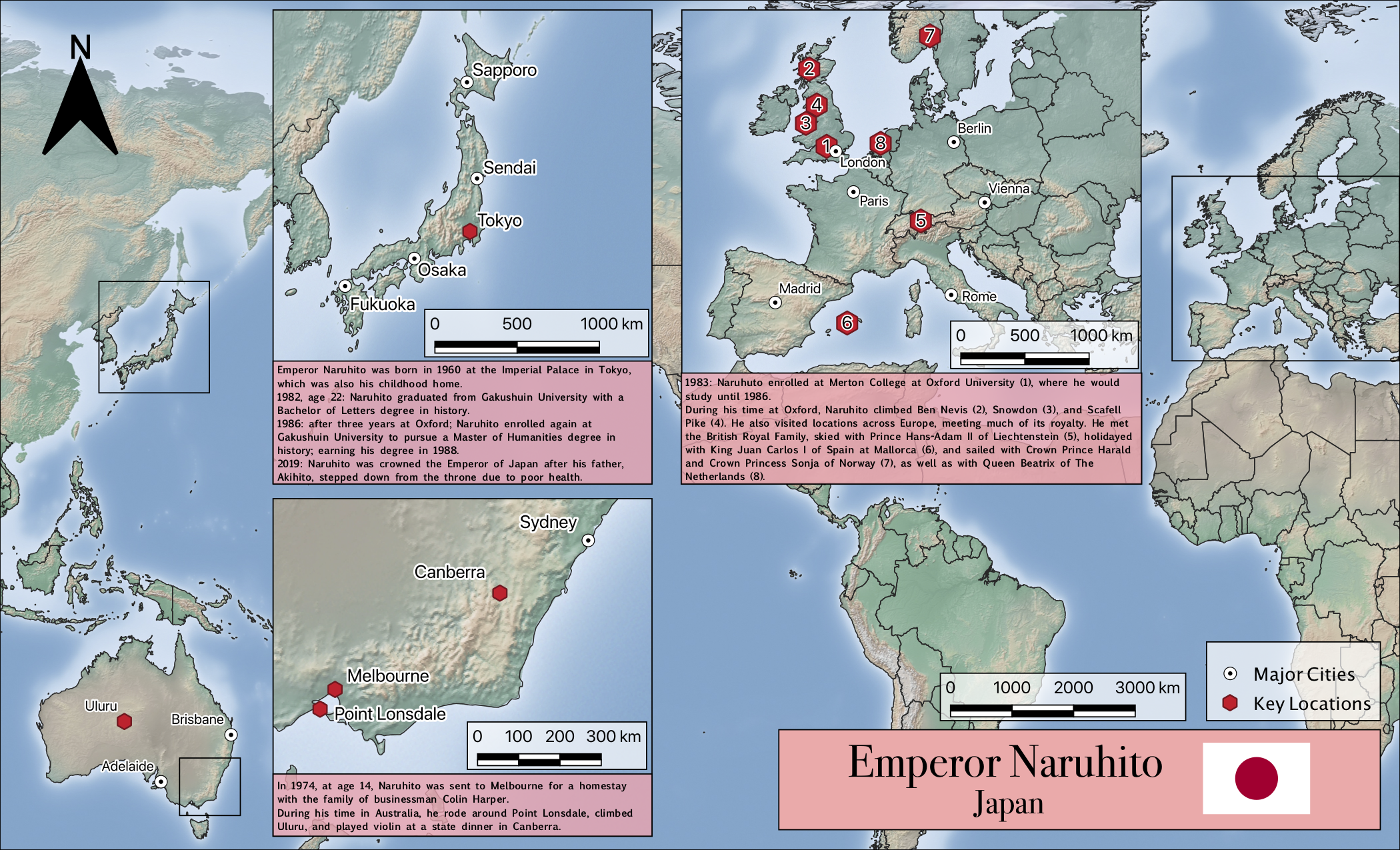
For this project, I was tasked with selecting a current head of state from some country
other than the United States, and creating a biographical map showing key locations in their
life and career.
I chose Emperior Naruhito of Japan, mainly because I like Japan, but also because the key
locations were scattered in multiple parts of the world so it gave me the challenge of
creating inset maps.
Note: While most national borders are present, I had to remove China and Russia because the Americas-centred projection I used caused severe spatial distortion that I didn't have the ability to fix.
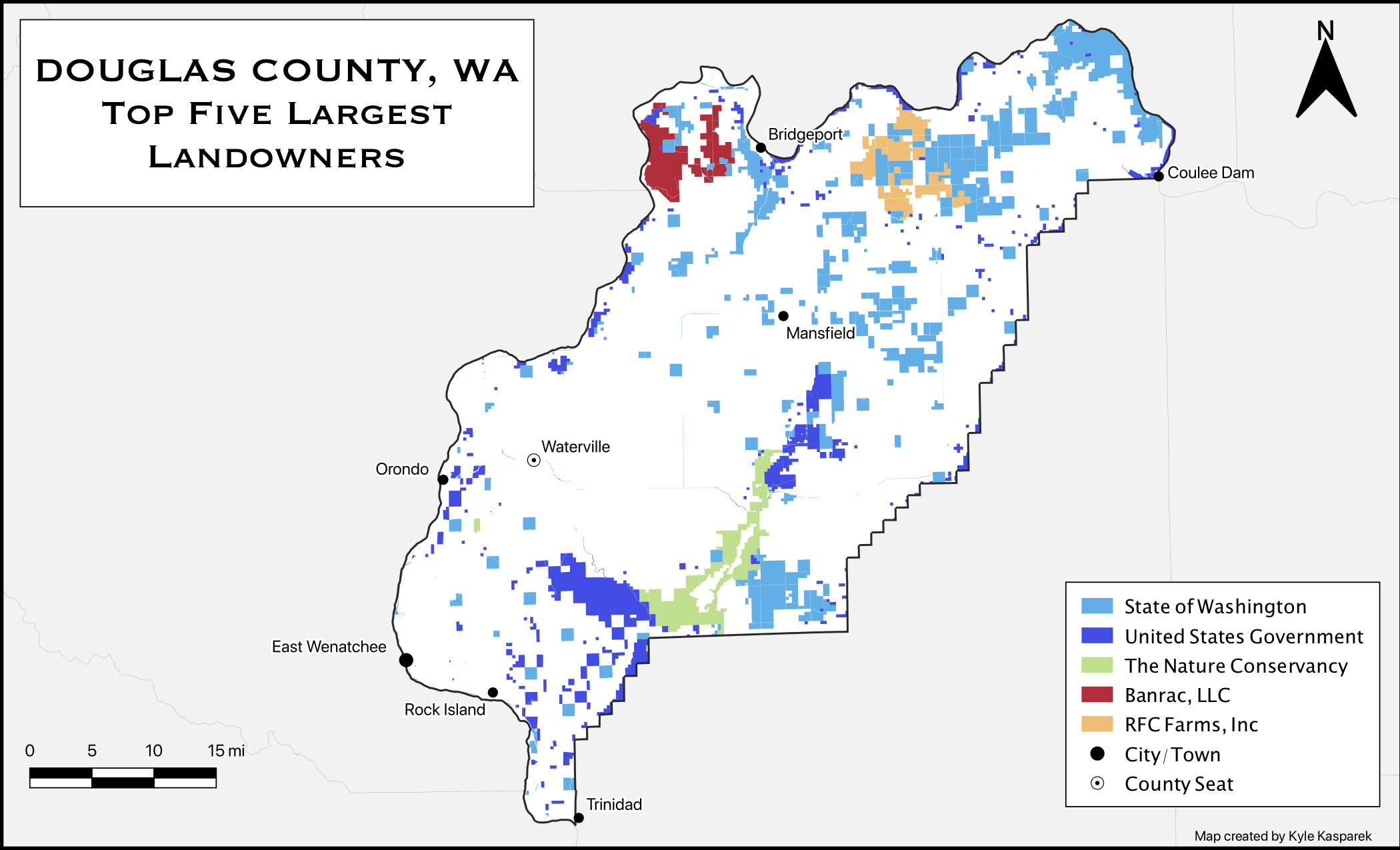
For this assignment, my task was to create a simple map depicting the top five largest landowners of Douglas County, Washington.
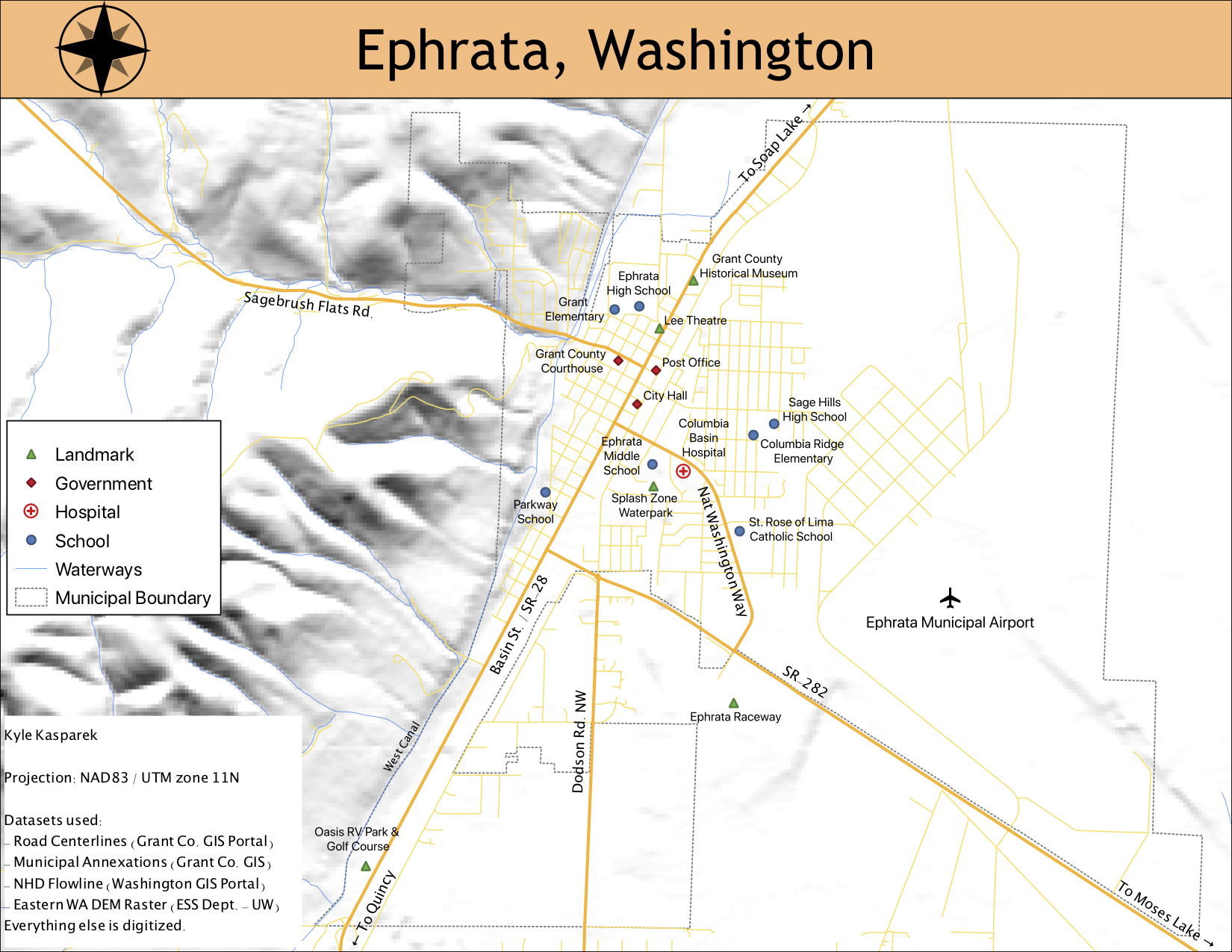
For this assignment, my task was to choose one in a list of 27 small communities in
Washington and produce a street map of it.
I chose Ephrata because of my familiarity with the community, being the closest in proximity
on that list to my hometown of Moses Lake.
(I would've chosen Moses Lake if it had been on that list...)
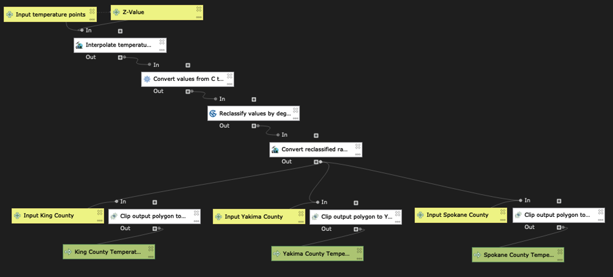
QGIS Process Modeller
Final Map Product
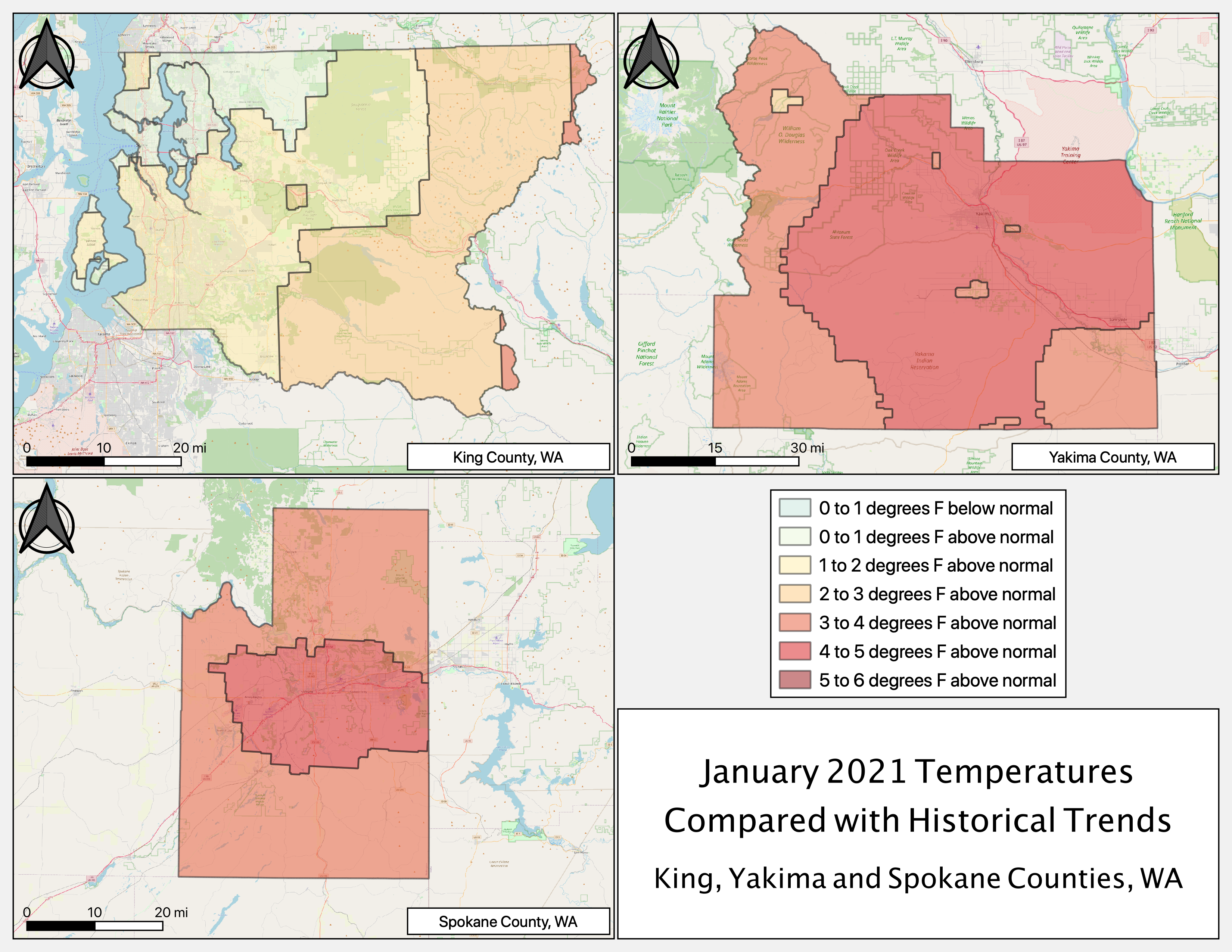
This map was created as part of a lab assignment in the course. The goal of the lab was to introduce
the concept of using the Processing Modeller in QGIS (or ModelBuilder in ArcGIS Pro) to automate the
process of interpolating temperature data across three Washington counties - King, Yakima, and
Spokane.
The model portion of the assignment involved adding the tools, inputs and outputs needed to take
temperature points for locations across the state, interpolate them, convert the temperature values
from Celsius to Fahrenheit, reclassify the values by degree, then convert the resulting raster to a
polygon then clipping it to shapefiles of three Washington counties. I decided to add inputs for all
three counties so that I would only need to run the tool once rather than three separate times for
each county.
From there, all that was left to do was create map layouts depicting the results, which falls under
general cartography. The map shown on the right was one of five maps created for the assignment.
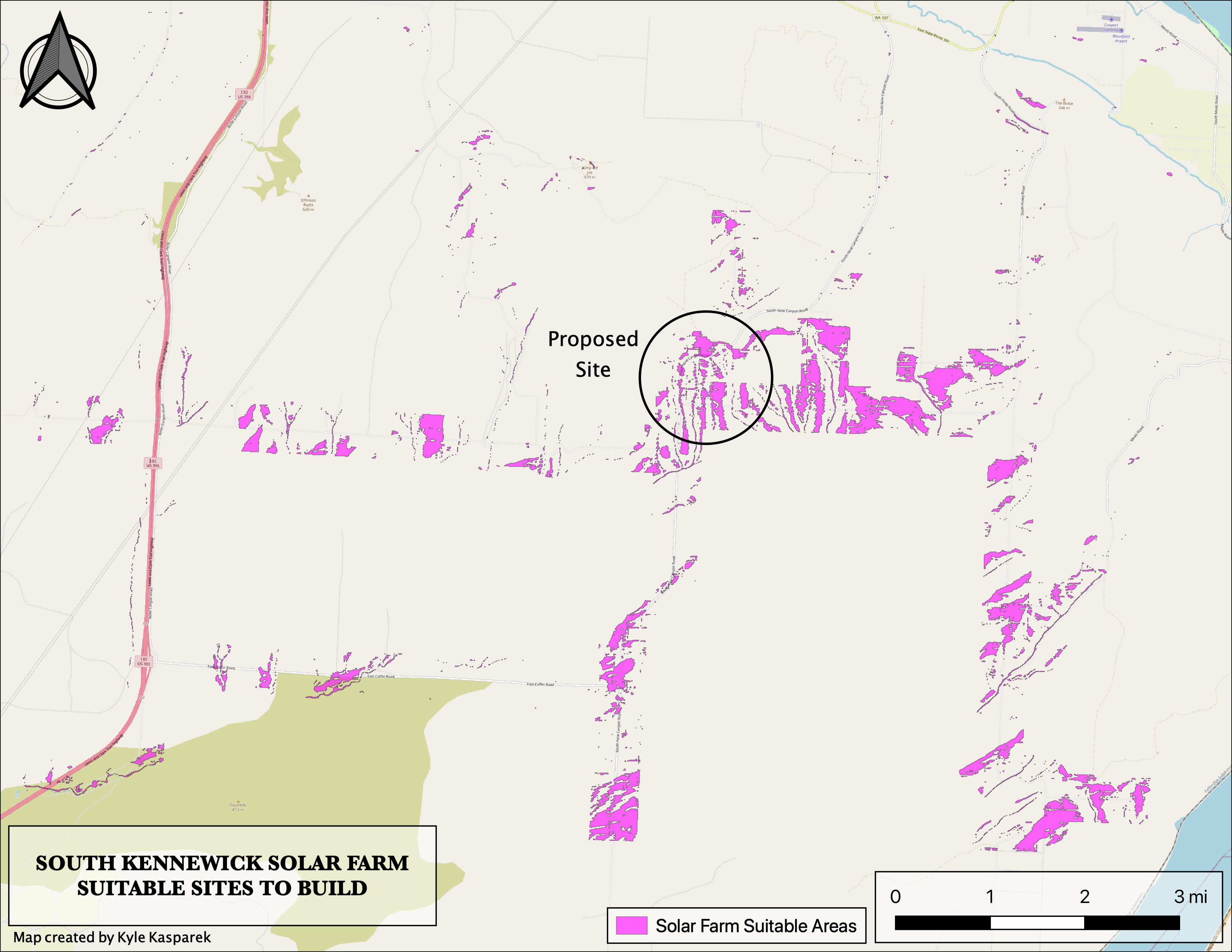
For this assignment, my task was to use my knowledge bank over the course and the previous two courses to narrow down potentially suitable areas for a commercial solar installation south of Kennewick, WA. Completing the task involved the use of tools to adhere to provided slope, aspect and road buffer criteria, then excluding areas visible from Interstate 82.
Side by Side Map
Interactive Bivariate Map
Bivariate Map
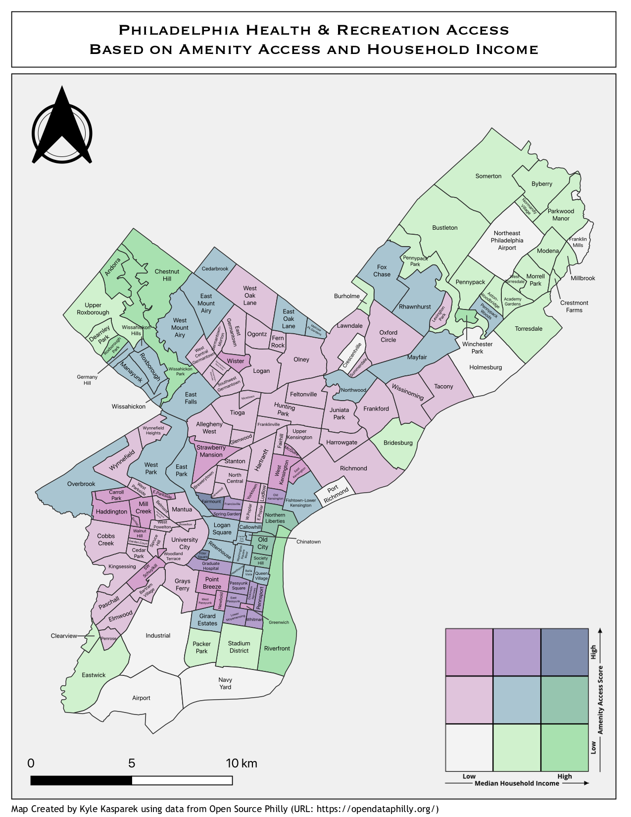
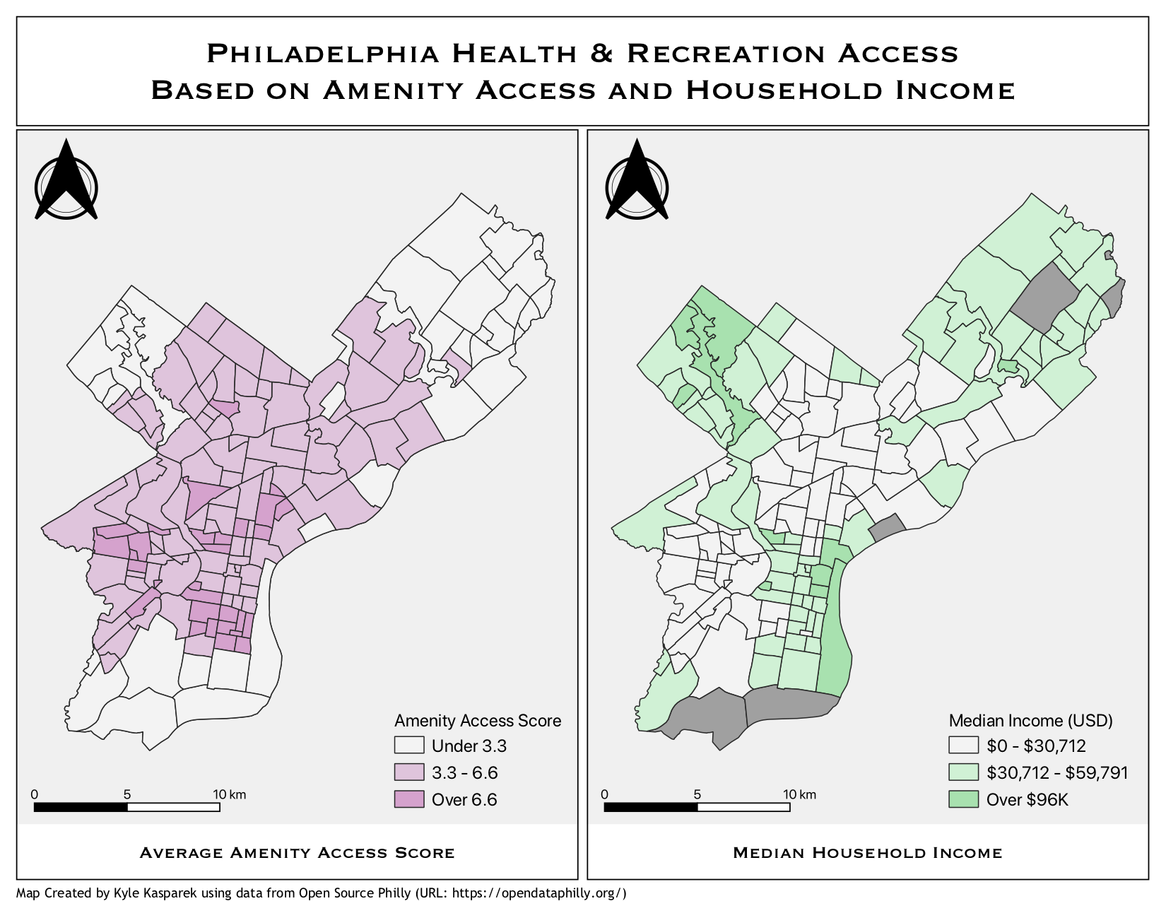
This map was created as part of the second big project in the course, a final project of sorts for the entire certificate program. The goal of this project was to utilize my skills and knowledge to determine how well-positioned certain outdoor health and recreation amenities are for residents in low-income neighbourhoods.
To create these maps, I grabbed data off the Open Data Philly portal and downloaded 10 datasets. With each dataset, I created a raster layer between 0 and 1 based on criteria to determine which areas have the best access to that amenity. From there, it was a matter of combining the rasters to create an average amenity access score, which together with income data to create the maps shown on this page. The map on the top-left is a side-by-side comparison, and the map on the right is a bivariate that combines the two. The map to the left is an interactive bivariate map created using Leaflet.